
A Formatting Impaired Writer
Formatting is not my strongsuit. At all. To quote one of my college professors: “I’m not going to mark you down on those last few pages, because obviously something happened and you didn’t intend for it to look like that.” So yeah, formatting and me? Hardly on the best of terms.
When I decided to go the indie route, I had to choose which aspects of the publication process I could handle on my own, and which I would have to shell out $$$ for. And, even though formatting has been the ugly, drooling, Dorito-breath monster in my closet for years, I decided to face the beast head on and at least TRY to format my own book before breaking down and hiring a professional.
Why, you ask? Two reasons:
1.) I am so painfully broke it’s not even funny.
2.) I felt that formatting was something I could actually learn to do well if I put in the time and effort. And, if successful, I would then be able to do it for all of my future books, thereby saving my (hopefully slightly less broke) future self some cash down the line.
As a format-challenged person, learning this skill was sort of like having a root canal minus the novacaine – something I have actually experienced, and yes it hurt like you-know-what. But after countless hair-pulling moments and a few pillow screams, I finally had a book that looked exactly the way I wanted it to. No weird spacing issues. No random alignment gaffes. Blank pages only where I intended them to be (and nowhere else!).
For some people, this might sound easy-peasy. For me, however, this was a Mt. Everest-level accomplishment. And since I know I can’t be alone when it comes to my formatting struggles, I decided to share some of the tips and resources that helped me, along with a few of the issues I considered while formatting my book for print.
Decisions, Decisions
If you decide to format your own manuscript, you’ll be in charge of choosing everything from the actual trim size of the book all the way down to the font size and type, line spacing, and how the first page of each chapter will look.
Some details that might affect these decisions:
-Book Length
-Genre
-Intended Audience
In my case, I have a novel for younger audiences (11-13 years), so an easy-to-read font was paramount. My book is also somewhat long, so I had to take the potential spine width into account as I looked at different trim sizes. The bigger your book’s trim size is, the larger the pages are and the more words you can fit on them. Which means a skinnier spine and a lower printing cost. However, books with extremely large trim sizes can be awkward and uncomfortable for readers to hold. So everything is about finding that right look and right balance for your specific novel. To gain one element, you might have to sacrifice another.
In my opinion, an ideal paperback has a trim size of 5″ x 8″. Because of my book’s length, I had to compromise on this a bit and go with 5.25″ x 8″. If you have a super short book, you might want to go the opposite way and choose the smallest trim size to make your book thicker.
Many professional novels have each chapter start on an odd numbered page, even if it would not naturally fall there. Because my book is long with fairly short chapters, this would have meant including a significant number of unnecessary blank pages. Since I do actually care about trees, I decided not to restrict myself in this way. I also elected to do without the standard header (alternating between author’s name and book title) on each page. Again, this was to save pages and keep the text easy to read.
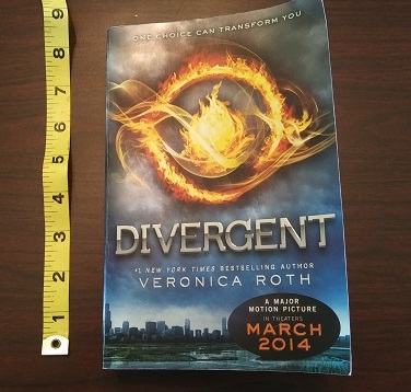
One thing that’s really beneficial (and also kinda fun) is to take a bunch of books off your shelf and actually measure them. You’ll be amazed at the range of sizes. Flip through each one and sample how their chapter openers look, where the page numbers are, how they display the header and footer, what fonts are used. There are so many different styles! Make a note of which books in your genre have the best “look” and try to emulate that.
If you’re writing a science fiction novel, you might want to use a futuristic font for the chapter headings to give it that sci-fi feel. For a memoir, chapter titles might look cool in a font that looks like handwriting (as long as it’s legible!). If you’re writing a heart-pounding action adventure set on a global stage, you may want each chapter opening to have additional information like what country the characters are in, what time it is, and how many minutes are left until the bomb goes off!
Below are some links and tips to help make your book both beautiful and professional.
Resources
- This is THE best video ever for formatting your print book in MS Word. This totally saved my life. The author explains everything and makes it all so easy a kindergartner (or me!) could do it. The vid covers common mistakes (and how to avoid them), mirror margins, gutter space, formatting chapter headings using styles, line spacing and more. The only things it doesn’t really touch on are drop caps (those pretty, extra big letters at the start of each chapter) and page/section breaks. But this will give you all the basics and you’ll be in great shape as you move on to some of the more intricate details.
- Here is a link to KDP’s guide to trim sizes. It also discusses bleed (when you want an image to go off the edge of the page) as well as their recommended margins for different sizes of books. (Tip: go bigger than recommended for the gutter margin).
- KDP’s instructions for formatting your print book. IMHO, the video posted above is much easier to follow, but there are a few elements here not included on that vid, e.g. the section break stuff, which is really important if you want certain pages NOT to have numbers on them. Page breaks are also important to learn about, especially when it comes time to format your ebook, so definitely don’t skip out on these lessons. The most valuable thing I got out of this page was the last part, which clearly explains how to export your final Word Doc(x) as a pdf, the form it must be in to upload it to your bookshelf.
- How to delete unwanted blank pages in Word! The method that really saved me was using the navigation pane. Worked every time. 🙂
- How to create drop caps in MS Word. (FYI, drop caps RULE! They make your book look awesome and professional. Tip: To change the appearance of your drop cap, e.g. how tall it is, click “Drop Cap Options.”)


Have Fun Building Your Book!
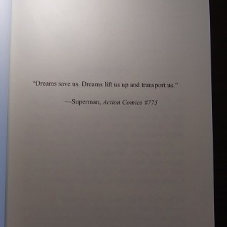
Reading about all of these new terms can be overwhelming for a first-timer. It definitely was for me! Just remember that it does get easier. Any problem you have or anything you can’t figure out how to do, just call on your old pals Google, Bing, and YouTube and they will help you find someone who can answer your question. If you want to do something special, like add a map to the beginning of your book, or an image next to each chapter title, or a blank page with just a quote right in the middle, don’t give up simply because it seems too hard. Keep trying until everything looks exactly the way you envisioned. You deserve it, and so does your book. 🙂
