Indie Publishing: Published (Finally!)

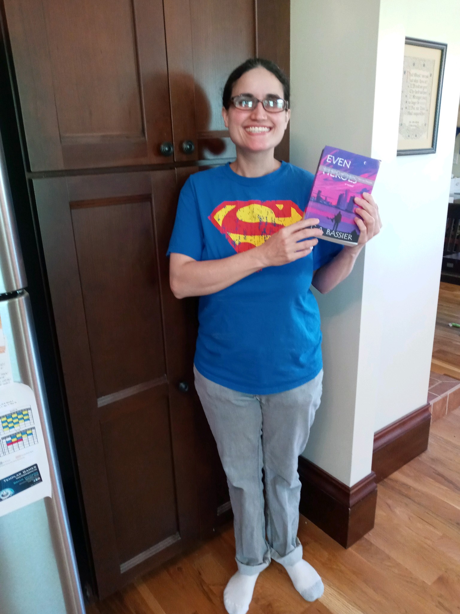
First things first: my debut novel is published. Like, for real. The official “birthday” for the eBook was January 1st, 2022. Its nearly identical twin, the paperback, was born the following day. Instead of announcing this joyous occasion to the world, my first instinct was to keep it a secret while I made sure everything was okay. Call me paranoid, but I had so many formatting problems – particularly with the eBook – that I figured it was better to be on the safe side than the “filled with horrific errors” side. I bought a copy of the physical book, and while that was being printed and shipped, I checked out the eBook on the few devices we own. Aside from an odd white border around the eBook cover (which has since been corrected), everything looks good.

So, it’s out there, and now I feel…weird. Not in a bad way. More in an “Okay, now what?” way. I mean, this book has been with me almost my entire adult life – all the way from that little spark of an idea I had over seventeen years ago, while talking to my brother in the parking lot after watching the movie Spider-Man 2. Just hearing how much those characters meant to him, and realizing how much they mean to so many people. The escape they offer. The hope they give.

That little spark led to sticky notes on my wall, which led to a handwritten, 300Kword first draft (three years to write, another two just to type). Once the word processing was complete, I remember feeling pretty smug about my own awesomeness. Then I started to read the book, and actually shed tears over how bad it was. At least, the early part of the book was bad. Towards the middle, when I learned not to describe in detail every time a character blinked or inhaled/exhaled, it got a little better. By the end, the writing was halfway decent but still a far cry from publishable.

I got painful but extremely valuable notes from my mom (who else but a mother would read a 1,500-page, not-so-well-written manuscript?). I revised, cut 100K words, revised again, got more notes from Mom and a few from my newly formed writing group. Sometimes, I’d let the book sit for months or even years as I worked on other projects, strengthening my craft. But I would always come back, cutting, polishing, searching for that diamond I knew was in there. When I finally got it down to 150K, I felt I’d hit a wall. I needed help to break through that last barrier, and found it in an amazing critique partner named Anna, who read the book with her then ten-and-a-half-year-old son and gave me the fresh perspective I so badly needed. Boring scenes, cut. Target age group, decided. Another 57K, gone.

So, yeah, this book has been over seventeen years in the making. But really, I think the story has been with me for even longer.

It might’ve started when I was in seventh grade, standing outside the main office at my junior high school, clutching a folded letter addressed to my band teacher. I paced for a good ten minutes, sweat soaking through my Mickey Mouse t-shirt, before finally darting inside and placing the note in my teacher’s mail cubby. Then I high-tailed it out of there, wondering if I’d just made the biggest mistake of my young life. Wondering if my teacher would believe me about the terrible things some of my classmates were doing to me behind her back – words I had to write, because I couldn’t say them out loud.

Amazingly, she did.

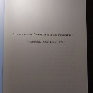
Or, maybe it started even earlier than that, when I was a small child watching X-Men cartoons with my brother in the mornings, then spending the afternoons jumping off the back deck with a garbage bag parachute, chasing the thrill of that gravity-defying moment of lift before the inevitable crash down to earth. Didn’t matter how many times my knees buckled, or my teeth clacked together, or my feet ached from that jarring impact. It was all worth it for that one little second of something more. That one instant when I felt like I was flying, even though such things are not possible in the “real world.”

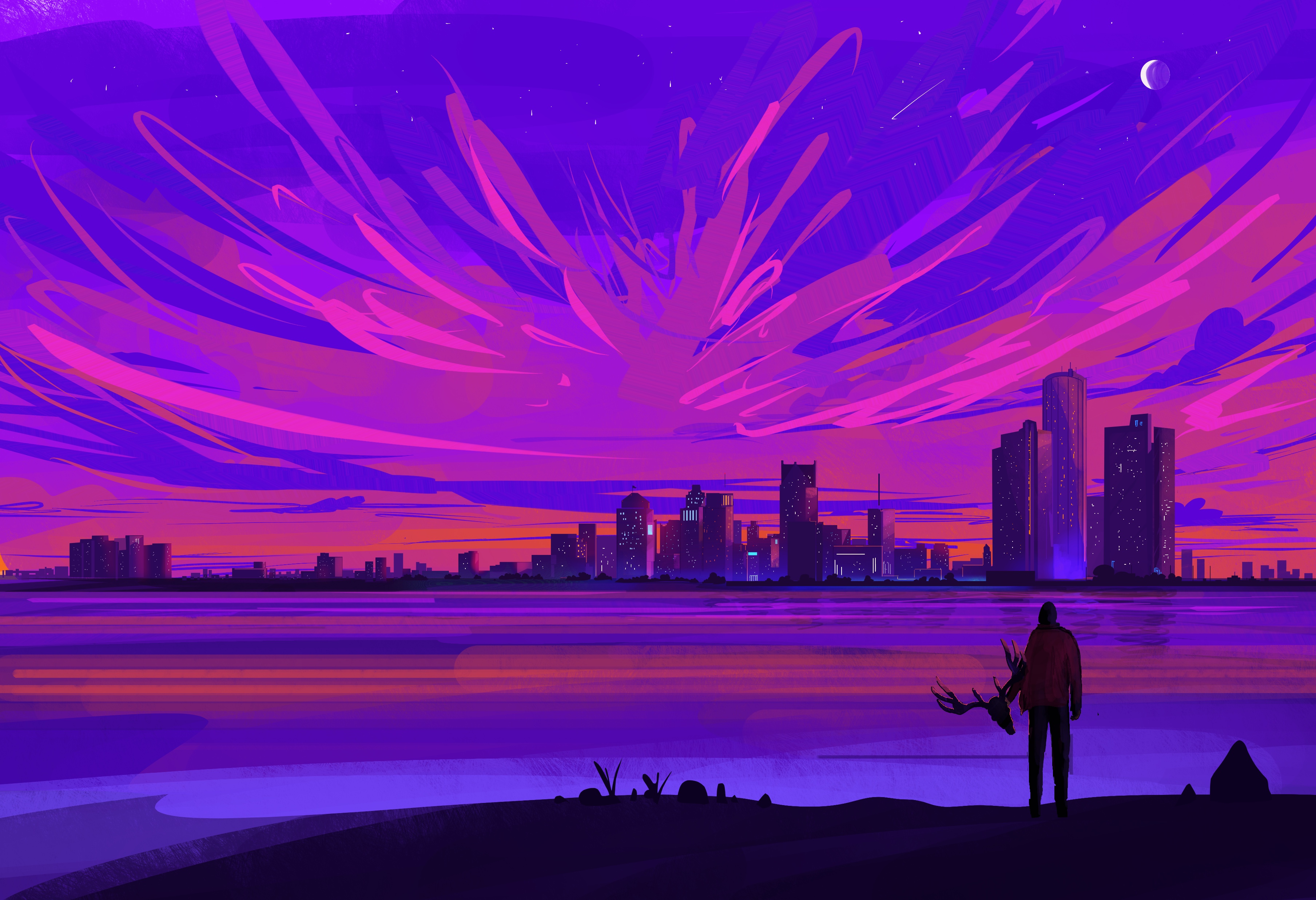
I wrote this book for that little girl. I wrote it for any kid who’s ever tied a red blanket around his/her/their neck and pretended to be a superhero out fighting the bad guys. I wrote it for all the kids who are standing outside an office right now, holding a letter filled with words they can’t say out loud. And I wrote it for everyone – young, old, or anywhere in between – who believes that inside each ordinary person lies an extraordinary one, just waiting to break free.

I hope you guys love it.

~G

Indie Publishing: Cover Art Reveal!

The artist who created the gorgeous image you see above is the insanely talented Muhammad Nafay. Please check out more of his breathtaking artwork on his Instagram or his page on ArtStation. Your eyes will thank you for it, trust me. 🙂 Then, once you’re finished soaking in all the pretty, read about my journey to finding the perfect cover art (and artist!) for my debut novel.

The Hunt Begins

My search began on websites that feature premade cover art. There are numerous advantages to purchasing art that is already created, the top two being: 1.) you know EXACTLY what you’re getting, and 2.) it tends to be more affordable, oftentimes around $60-75 for an eBook cover, a bit more for a wraparound paperback cover (if you’re doing a print book, definitely get the wraparound – believe me, it’s worth it). Below are some of the sites I searched, and they all had a wide selection of excellent work:

I had SOOOO much fun looking at all the amazing covers. I found potential book covers for several of my future books as well as possible cover art for novels people in my writing group were working on. I even made an account on SelfPubBookCovers.com so I could bookmark some of my favorite pieces and artists. The first two sites listed above are especially awesome because you can search by genre as well as by specific images you might be interested in. Like, a raven or an alien or a zombie or a tattered American flag. I kind of went a little crazy window shopping. 🙂 Alas, in the end, although I found some “maybes,” I didn’t find a cover that reached off the screen and grabbed me for this particular book. So, I found myself at the next step:

Choosing an Image

I am NOT a digital artist. I will flat-out admit that. If you’ve read this blog before, you’ve probably seen some of my little “illustrations.” To say they are basic would be putting it kindly. Thus, I knew I’d never be able to create my own cover art, but if I was going to commission a piece, I at least needed to be able to tell the artist what I wanted. Which meant I actually had to decide what I wanted. This was not easy and involved several weeks (possibly months) of me playing around in Krita (a free, open source art program I love because I think it’s fairly easy to learn).

I asked everyone who’d read my book about any ideas they might have for the cover image. Then, I made numerous sketches (including some very horrible ones that still give me nightmares – because seriously, a four-year-old could’ve done better #notkidding) and also tried creating some artwork using free-to-download images from Pixabay. Eventually, after all that tinkering, I wound up right back where I started, at the very first sketch I’d made. It was a really close call between that and a piece of vector art that looked pretty cool, but in the end Sketch #1 just felt right. It had the mood I wanted to convey.

Finding the Artist

Now that I had an image in mind, I could finally begin my search for an artist. As someone who’s been beta reading on Fiverr.com for the past few years, I was SUPER excited to contribute to the freelance marketplace as a buyer. There are so many talented artists out there, it’s unbelievable. I wanted to hire them ALL, and had to force myself to focus on the specific mental picture I had in mind and who would be best suited to deliver that image.

When I saw Muhammad’s portfolio for the first time, it truly took my breath away, and honestly, his artwork still does that every time I look at it. Some of the things that struck me about Muhammad’s work were his stunning use of color, his majestic skylines, and the cinematic quality that really makes you aware of how big the universe is. Another thing I noticed about his artwork was that it looked gorgeous and eye-catching even at a thumbnail size, which was really important to me. Also, as you can probably tell from the image above, the deer is an important symbol in my book, and coincidentally a few of Muhammad’s other pieces also had deer in them, so it just seemed like fate. I am beyond lucky he was able to take on my project, and I am absolutely blown away by the results. I gave him a childish scribble and a brief description of my novel, and in return he gave me perfection. 🙂

Lettering and Proof Copies

Once I had my beautiful cover art, I tried my best not to ruin it with awful lettering. I used Krita and KDP’s book cover template (pasted over the art as a new layer with the opacity turned way down) to make sure none of the words went off the page or ventured into forbidden territory, like the bar code area. I just wanted something simple that wouldn’t detract from Muhammad’s brilliant artwork, and I am happy with how it came out. I actually tailored my book description to the amount of space available on the back cover, and in all honesty, it forced me to pare down the word count and I wrote a better, tighter blurb as a result.

The final product, after deleting the template layer in Krita.

Next, I uploaded the book to KDP’s Cover Creator, chose an option that featured the whole cover image (and nothing else), selected a style that only had text (no space for an author photo), then simply deleted all of the text on the template. In other words, I cheated the system :). You do not actually want to use Cover Creator to design your cover – you just cannot manipulate text and images the way you can in a regular art program. The options are very fixed, and that is not a good thing.

Now that the cover and book text were uploaded to my bookshelf, I had one last step: ordering a proof copy to make sure the whole thing had not gone disastrously wrong. This is not as easy as it sounds, people. I’m not joking when I say that I almost accidentally published my book. When it’s late at night, and you’re starting to get confused, bad things happen. Like coming thisclose to hitting the “Publish” button by mistake. My finger actually hovered. Briefly. But something didn’t feel right. So, I did a quick search and found this helpful video which explains how to order proof copies without publishing your book. A true lifesaver!

Me, after receiving my first proof copy. For days afterward, I could not stop picking it up and looking at it. 🙂

My first proof arrived really fast, and as you can see from the rather idiotic grin on my face, I was satisfied with how the book came out. Also, as an added bonus, the cost of printing plus shipping and taxes for my proof copy is exactly $11.21. Which, for my fellow X-Philes out there, just felt like a little bit of icing on the destiny cake. 🙂

Coincidence, fate, or a global conspiracy? You decide. 🙂

I hope hope HOPE that I’ll be pushing that scary “Publish” button very soon. In the meantime, thank you for joining me on this crazy but wonderful journey to realize a dream that has been over 15 years in the making.

Love to you all, and Keep Writing!

~Gretchen

Indie Publishing: The eBook Saga

Not So Fast

So, after getting my print book all squared away, I thought I was close to publishing my novel. I just needed to format my eBook, which, thanks to Kindle Direct Publishing’s proprietary software (called Kindle Create), was supposed to be a breeze even for a newbie like me. You just load your Word document into the program, polish up your book so everything looks pretty, and you’ll be good to go. Easy-peasy…right?

To be fair, I think Kindle Create IS reasonably easy to use, and for most people it would be a perfectly good tool to create a lovely Kindle eBook. For me, the problem came when my book showed a glitch in one device mode in KDP’s online previewer. All the other previews looked great, but this weird glitch really had me concerned, so I reached out for help on the wonderful KDP Community forums. Many people responded right away with thoughts and suggestions for getting to the root of the issue.

I tried everything they suggested as well as some of my own ideas. In the course of trying to solve this mysterious glitch, I removed all fixed fonts from my book, uploaded a Word document directly, reformatted my Word doc and tried again (I later learned I did a really horrible job of reformatting it), and eventually, as a last resort, actually learned a little bit about coding (I knew nothing prior to this experience), saved my book as a plain text file, and coded it myself from scratch using HTML and CSS.

Dark Days

When even THAT failed to fix my issue, I contacted KDP technical support for assistance. They were very nice and worked hard to figure out what I was seeing in that one wonky preview, but ultimately came up with bupkis, and left me feeling like they might not even believe that I had seen anything abnormal in the first place (despite numerous screen caps showing the issue). I’m not going to lie to you, people – things were looking pretty dark at that point. My life had been on hold for months, and I just had no idea how to move forward.

A Helping Hand

Desperate and out of options, I turned to the KDP Community again, and an amazingly kind, professional eBook formatter named Hitch came to my rescue and offered to look at my files and try to see what was going on. She did an absolutely incredible job combing through my eBook, searching for any dastardly formatting that might be responsible for the glitch.

To date, despite everyone’s best efforts, there is still no known cause for what I am seeing in that one preview. There was a lot of crazy stuff in my Word file (like, a LOT), but nothing that should cause the specific glitch I am experiencing, and nothing in the EPUB file, either. As frustrating as it is, we may never know the answer. BUT, after talking to an experienced pro who has formatted thousands of eBooks, I feel like there is a very good chance the eBook will render correctly out in the real world. In other words, I’m hoping, based on all of the available evidence (including the MOBI version showing up nicely on my Fire), that the glitch is limited to that one preview, and I am ready to move forward with publication. Phew!

The point of this post, however, is not to whine about my eBook woes, but rather to focus on the positives of what I learned as the result of my experience. I learned the basics of coding, which was really fun and massively useful (I’ll have a separate post about this somewhere down the line). I learned how important it is for me to get familiar with Styles/Headings/etc in Word, because not knowing these things can make an anthill-sized task into a Mt. Everest-sized one. And I learned that the indie publishing community is filled with wonderful people who care about newbies and want to help us swim rather than sink in the scary ocean that is Kindle Direct Publishing.

Next Up: Cover Art Reveal! 🙂

Indie Publishing: Fun with Formatting

A Formatting Impaired Writer

Formatting is not my strongsuit. At all. To quote one of my college professors: “I’m not going to mark you down on those last few pages, because obviously something happened and you didn’t intend for it to look like that.” So yeah, formatting and me? Hardly on the best of terms.

When I decided to go the indie route, I had to choose which aspects of the publication process I could handle on my own, and which I would have to shell out $$$ for. And, even though formatting has been the ugly, drooling, Dorito-breath monster in my closet for years, I decided to face the beast head on and at least TRY to format my own book before breaking down and hiring a professional.

Why, you ask? Two reasons:

1.) I am so painfully broke it’s not even funny.

2.) I felt that formatting was something I could actually learn to do well if I put in the time and effort. And, if successful, I would then be able to do it for all of my future books, thereby saving my (hopefully slightly less broke) future self some cash down the line.

As a format-challenged person, learning this skill was sort of like having a root canal minus the novacaine – something I have actually experienced, and yes it hurt like you-know-what. But after countless hair-pulling moments and a few pillow screams, I finally had a book that looked exactly the way I wanted it to. No weird spacing issues. No random alignment gaffes. Blank pages only where I intended them to be (and nowhere else!).

For some people, this might sound easy-peasy. For me, however, this was a Mt. Everest-level accomplishment. And since I know I can’t be alone when it comes to my formatting struggles, I decided to share some of the tips and resources that helped me, along with a few of the issues I considered while formatting my book for print.

Decisions, Decisions

If you decide to format your own manuscript, you’ll be in charge of choosing everything from the actual trim size of the book all the way down to the font size and type, line spacing, and how the first page of each chapter will look.

Some details that might affect these decisions:

-Book Length

-Genre

-Intended Audience

In my case, I have a novel for younger audiences (11-13 years), so an easy-to-read font was paramount. My book is also somewhat long, so I had to take the potential spine width into account as I looked at different trim sizes. The bigger your book’s trim size is, the larger the pages are and the more words you can fit on them. Which means a skinnier spine and a lower printing cost. However, books with extremely large trim sizes can be awkward and uncomfortable for readers to hold. So everything is about finding that right look and right balance for your specific novel. To gain one element, you might have to sacrifice another.

In my opinion, an ideal paperback has a trim size of 5″ x 8″. Because of my book’s length, I had to compromise on this a bit and go with 5.25″ x 8″. If you have a super short book, you might want to go the opposite way and choose the smallest trim size to make your book thicker.

Many professional novels have each chapter start on an odd numbered page, even if it would not naturally fall there. Because my book is long with fairly short chapters, this would have meant including a significant number of unnecessary blank pages. Since I do actually care about trees, I decided not to restrict myself in this way. I also elected to do without the standard header (alternating between author’s name and book title) on each page. Again, this was to save pages and keep the text easy to read.

My novel has the same trim size as the paperback edition of Divergent

One thing that’s really beneficial (and also kinda fun) is to take a bunch of books off your shelf and actually measure them. You’ll be amazed at the range of sizes. Flip through each one and sample how their chapter openers look, where the page numbers are, how they display the header and footer, what fonts are used. There are so many different styles! Make a note of which books in your genre have the best “look” and try to emulate that.

If you’re writing a science fiction novel, you might want to use a futuristic font for the chapter headings to give it that sci-fi feel. For a memoir, chapter titles might look cool in a font that looks like handwriting (as long as it’s legible!). If you’re writing a heart-pounding action adventure set on a global stage, you may want each chapter opening to have additional information like what country the characters are in, what time it is, and how many minutes are left until the bomb goes off!

Below are some links and tips to help make your book both beautiful and professional.

Resources

  • This is THE best video ever for formatting your print book in MS Word. This totally saved my life. The author explains everything and makes it all so easy a kindergartner (or me!) could do it. The vid covers common mistakes (and how to avoid them), mirror margins, gutter space, formatting chapter headings using styles, line spacing and more. The only things it doesn’t really touch on are drop caps (those pretty, extra big letters at the start of each chapter) and page/section breaks. But this will give you all the basics and you’ll be in great shape as you move on to some of the more intricate details.
  • Here is a link to KDP’s guide to trim sizes. It also discusses bleed (when you want an image to go off the edge of the page) as well as their recommended margins for different sizes of books. (Tip: go bigger than recommended for the gutter margin).
  • KDP’s instructions for formatting your print book. IMHO, the video posted above is much easier to follow, but there are a few elements here not included on that vid, e.g. the section break stuff, which is really important if you want certain pages NOT to have numbers on them. Page breaks are also important to learn about, especially when it comes time to format your ebook, so definitely don’t skip out on these lessons. The most valuable thing I got out of this page was the last part, which clearly explains how to export your final Word Doc(x) as a pdf, the form it must be in to upload it to your bookshelf.
  • How to delete unwanted blank pages in Word! The method that really saved me was using the navigation pane. Worked every time. 🙂
  • How to create drop caps in MS Word. (FYI, drop caps RULE! They make your book look awesome and professional. Tip: To change the appearance of your drop cap, e.g. how tall it is, click “Drop Cap Options.”)

Have Fun Building Your Book!

Reading about all of these new terms can be overwhelming for a first-timer. It definitely was for me! Just remember that it does get easier. Any problem you have or anything you can’t figure out how to do, just call on your old pals Google, Bing, and YouTube and they will help you find someone who can answer your question. If you want to do something special, like add a map to the beginning of your book, or an image next to each chapter title, or a blank page with just a quote right in the middle, don’t give up simply because it seems too hard. Keep trying until everything looks exactly the way you envisioned. You deserve it, and so does your book. 🙂